
Scott Schwertly
2014-07-07
The 4 Basic Principles of Presentation Design
Source: SlideShare


Creating a beautiful presentation requires a symphony of visual elements to work together for a "big picture." Designers seek to make the entire vision work together in terms of how each part interacts. This includes layout, typography, and imagery, which all add up to a cohesive set of design elements. So, how can you orchestrate the chaos of design in your next presentation? Use the principles below to guide your way.
1. Balance
There are two types of balance: symmetrical and asymmetrical.
Symmetrical Balance: With this type of balance the elements on both sides of the design are in similar location and size. If you were to draw a line down the middle of a symmetrical design, it would be a mirrored image on both sides. An example of this would be the human face.
Tip: You can use this technique by making sure lettering, images, and other elements are aligned and equally weighted on both sides of a slide.

Asymmetrical Balance: Each side of the design is different, yet still balanced. For example: You could have one large box on the left side and several smaller boxes on the right. This kind of balance creates a more visually intriguing dynamic on a slide.
Tip: Incorporate asymmetrical design by using larger visual elements in one area of the space, until the place you want the viewer to focus on is featured.

2. Emphasis
It is important to have some element of your design that stands out and grabs the attention of your audience. You can do this by using the size, color or placement of the object to increase the focus on a certain part. To select the element of design to emphasize, ask yourself: What is the most important feature of this slide?
Tip: In order to add emphasis, make your text bolder, an image larger or use a color brighter than your base.

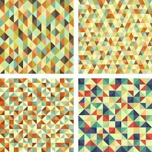
3. Unity
Your design should always feel unified so that all of your slides are connected together visually, and your deck has a consistent look and feel. The elements on your page must relate to one another through design elements such as color, shape, texture and so on. For example, if the elements on the page feel like they were placed without purpose, then your design will feel scattered, and your audience will likely be confused about the tone of your message.
Tip: Study color theory, typography and the balance principles detailed above to ensure that all of the elements flow together to create a cohesive design.

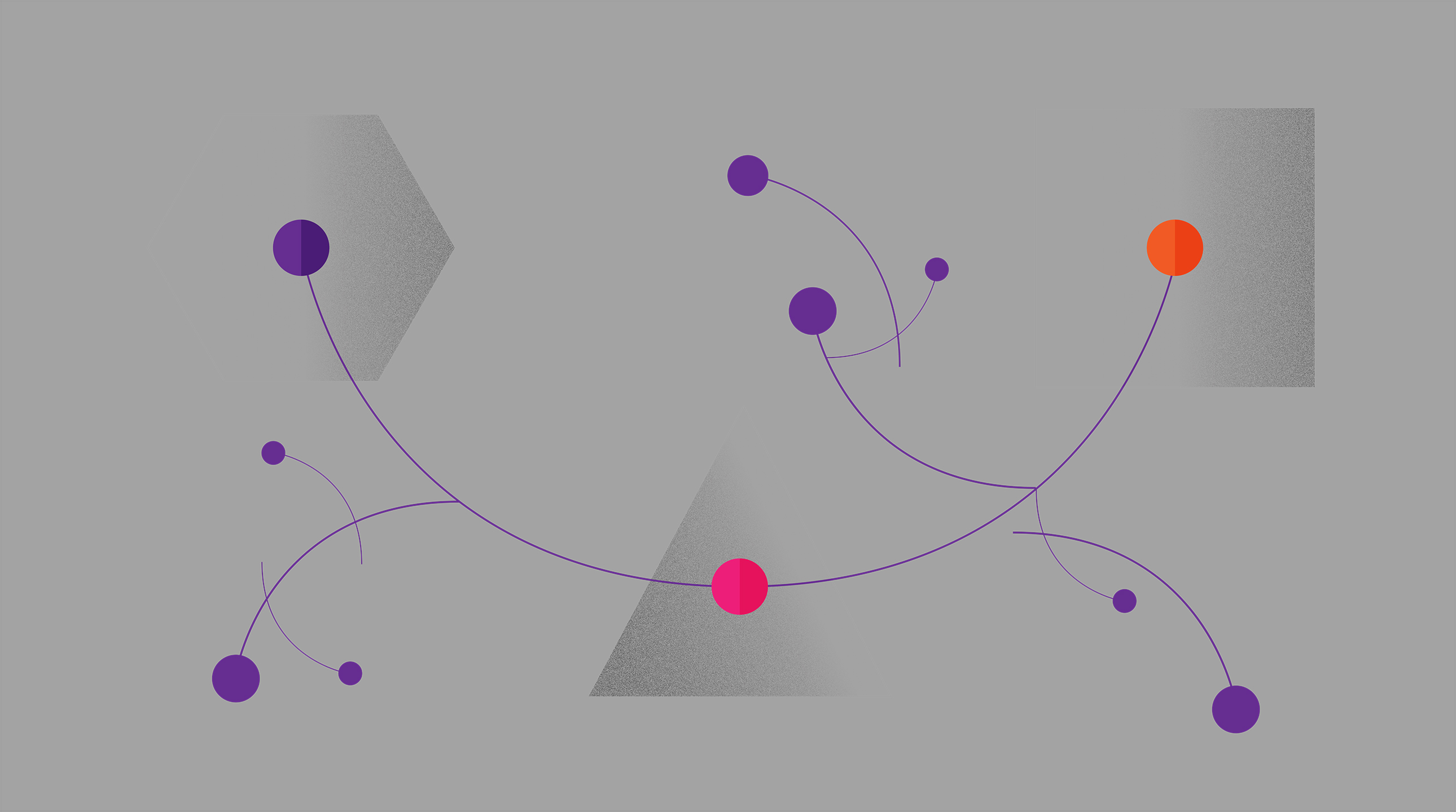
4. Movement
Designers often use curved lines to instill a sense of motion, and to encourage the eye to move sequentially from one point to the next. This can be an important tool when you are trying to move an audience through a story, or present a series of information on a slide.
Tip: Try using a curved line that moves through your text, from image to image or even slide to slide. Curved lines are also great for creative chart layouts. Ditch the standard chart designs for a layout that utilizes curved lines to draw eyes to your various points.
Putting It All Together
Developing an eye for these different design elements can be learned, and there are plenty of resources online that can help guide you along. Think of the overall elements of design as a way to edit down the visual pieces of your existing presentation in order to organize and make them more cohesive. Next time you work on a presentation, go through this list and check off the elements it has. Then, try to incorporate any missing pieces in your next draft. You’ll be thinking like a designer in no time.


Qatar
Commercial bank tower, West Bay,
15th floor, Doha, Qatar
PO Box 27111
+ 974 50 239 329
QATAR@CREAPIX.NET